UI Design and Technology Interaction Can Have an Impact on Revenues
Tuesday, February 20, 2007
Ecommerce is great, when it works. But it is similar to anything related to technology: when everything works everyone is happy, however, when something breaks the deficiencies are very noticeable, bad things happen, and we probably curse our dependency on technology.
In some cases, when something goes wrong lives are lost and millions of dollars are lost. For this entry, the consequences are not so dreary but I thought worth while analyzing.
UI Design and RevenuesTying revenues to UI design is not very easy. The problem is with performance measures, for example, how do you know that the location of the "buy" button in your site is costing you 10 sales out of 100.
Use Cases and focus groups can help identify those hard to find user interface issues. However, sometimes, minor things go unnoticed and are not really problems unless someone points them out.
Yesterday, I ran into a very common issue, but I never thought it was much of a problem until it was a problem for me. I was buying a few books from chapters.ca and when I came to the place to enter my credit card information I screwed up on the expiry date. The worst part of it all is that I didn't find out until 3 hours after I placed my order.
The problem I had was that I had too much control of the year field--it currently is a text field. In other words, the developer(s) of the chapters.ca application gave me too much credit and thought that I may be an expert at typing 2 digit numbers.
This is what the credit card entry fields look like:
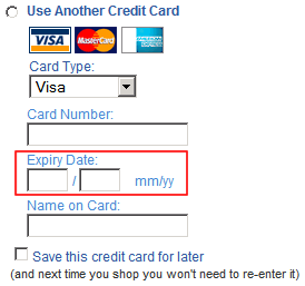
I have highlighted the expiry date fields (text field types). The expiry date on my credit card is "07." I typed "97" then clicked the place order button promptly, without checking the information I had just typed in (hey, I'm buying online I have no time to waste).
In a typical QWERTY keyboard the 0 and 9 are right beside each other and I didn't find out until 3 hours later that I had entered "97." I got an email telling me that there was a problem with the expiry date of "XX/2097" and that my order was actually canceled.
The cancellation is a problem for chapters because there is no product differentiation on books and I can in fact get the same books at amazon.ca for the same price. So I went to amazon and placed the same order. This is what the credit card entry fields look like:
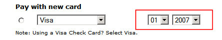
You can see that I have less control: drop downs only let me select a set of predefined dates, which is good in my case as I have less chance to screw up--and I didn't.
I'm not saying that amazon's site is better than chapters' (I buy things from both interchangeably) but in this case two issues made the difference of where I spent my money: first, I had too much control and I screwed up the date entry process, which can be fixed by using drop downs; and second, my order was canceled, no questions asked, which is probably much harder to fix. (The cancellation email read that there was a problem with the expiry date, my order was canceled, and if I really wanted I could place the order again.)
The latter, is probably an operational issue, and is probably intentional. I'm guessing that for chapters to keep my order open they need someone to take a phone call to rectify the problem, whatever it may be. However, chapters doesn't have an 800 number or any number, for that matter (at least, I couldn't find one on their site). Chapters.ca does business on the web, only (note that I mean the web site, not the actual brick and mortar stores).
As per the date field, as software engineers, we should make UIs as intuitive as they can be and assume that the user will screw up. Not because users are not smart, but because web application have too many things going on: links, buttons, images, etc. So we must anticipate and minimize the chances for something to go wrong (and something will go wrong), specially when there is money involved.
In this case, limiting my choices at checkout time to two clicks to find out my card's expiration date is much better than letting me enter an invalid year (I have four keys to press). But worst of all, letting me know 3 hours later that I had a problem with my submission, and in the process cancel my order and not have a real person to help rectify the problem so that I don't spend my money somewhere else.
Technology Interaction and RevenuesWhile buying online, there is the potential that we, as users, will make mistakes. The question is how will a company handle the issue and what it will do to rectify the mistake?
In my example above, chapters canceled my order and I had no way to talk to anyone to just correct the year of my card's expiry date. Because of this, I ordered the same items from chapter's competition, amazon. (Note that I already hypothesized why chapters canceled my order: it's probably cheaper to just cancel orders than hiring phone operators.)
My order wasn't in the thousands, however, if there are more customer that did the same thing I did, then something needs to be looked at to rectify the problem. (Actually, finding out if this is happening often is probably not that hard: chapters has all the data, it is just a matter to mine it properly.)
But the issue is not only the lost revenue of one transaction. The problem is that "future intentions" are affected by the experience with a company's technology. Research has found that if users' interactions with technology (in this case, the web site) are not satisfactory, users' future intentions are affected and it is more likely that paying customers will not come back.
This sounds obvious, but there have been quite a few empirical studies between customer satisfaction and repeat transactions (J.B. MacDonald, K. Smith.
Industrial Marketing Management 33, 2004, 107-116). My point is that not having someone to help out with the odd transaction, users will be less likely to use chapters' ecommerce site.
I will likely buy from chapters again, but this time I found it easier to just order from one of their competitors. My intention here is not to pick on what went wrong with chapters' site (like I said, when everything works, everyone is happy), but to highlight that a very minor design decision can have a big impact on revenues.
In this case, less choices in the user interface when typing an expiry date is probably the way to go. It means that orders from careless typers, like me, are not lost to the competition.
Comments: