Bank web sites and UI consolidation
Wednesday, January 21, 2009
We think of banks as very formal companies, with deep managerial layers and huge operation budgets. I never thought, however, that because of the homogeneous service they provide (anything to do with money) they would consolidate their web sites' interfaces.
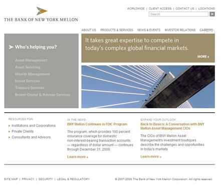
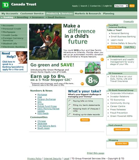
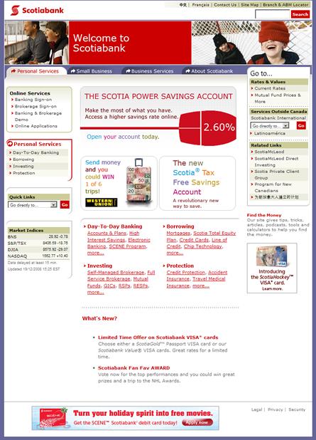
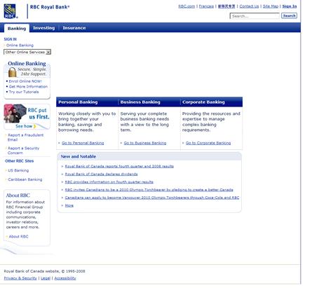
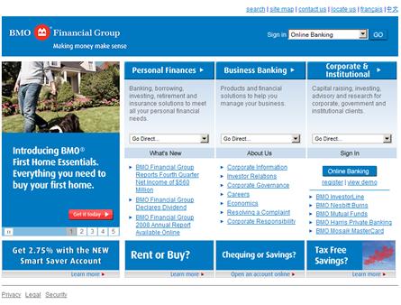
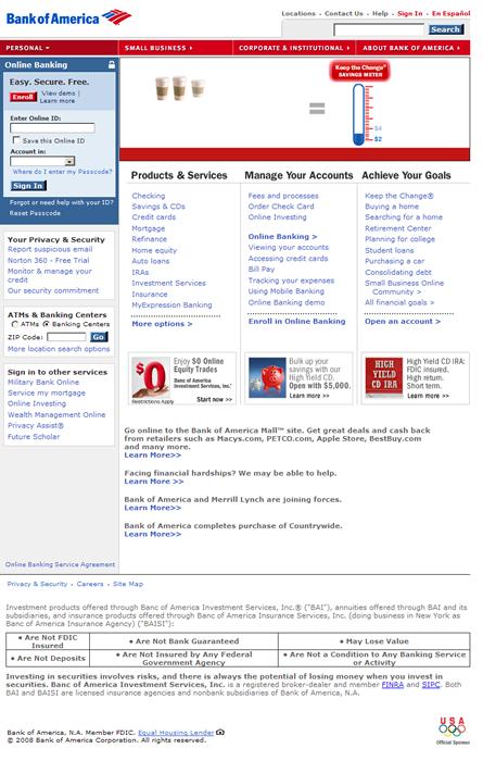
I gathered a few screen shots of some North American banks for the sake of comparison: they seem to have something in common, don't they? They seem to have similar template and tabbing separation of content. I admit that it's hard to separate a lot of content in web pages in anything but tabs; however, I don't understand why they all decided to use the same style.
Perhaps it has to do with not wanting to be
too different, which at first sight seems to be a mistake: why not be different and be the coolest bank site ever?
No one can dispute banks' web sites can create competitive advantage; Bank executives know this. However, the issue is that the switching cost for customers is too high: pretty web sites don't get customers to deposit their money in any particular bank. What's more, a bank's web site can be leading edge and be the most function-rich application in the history of the internet, but if no one goes to the site it doesn't really matter how well designed it is. For example, it's very unlikely for me switch to a different bank just because bank "X" offers me a better online banking experience. I make due with what I have, because I kind of have to. And I'm not in the minority: a bank preference is a lifetime commitment.
The question I'm trying to answer here, however, is why do the sites look similar? For this, I'm bringing in one of the concepts of game theory: the UI consolidation that I'm pointing out here seems to follow a
Tit-for-Tat strategy. These sites are public, and I'm sure that bank designers and IT departments snoop around each others' web applications. So if one site offers a really good function, others banks are likely to follow a few weeks later. It's part of competitive behavior.
So the issue is that not many banks want to be leaders of the pack in terms of having the coolest site, because it costs a lot of money to be leading edge. More important, the returns on investment are not guaranteed. Like I said, bank customers are unlikely to switch to a different bank because of their web site. Therefore, banks spend just enough not to drive their clientele away from their services.
Which brings me to the WUI (web user interface) consolidation: first, most banks are just good enough and don't have to be better than the competition; second, not many banks want to be the top-dog for the fear of being too different and for the fear of spending too much money that will not result in client attrition.
I say that there has to be a balance: dare to be different, but cost conscious. In the end, it will pay off.
For your pleasure, here are the screen shots of my survey:
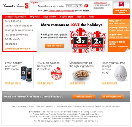
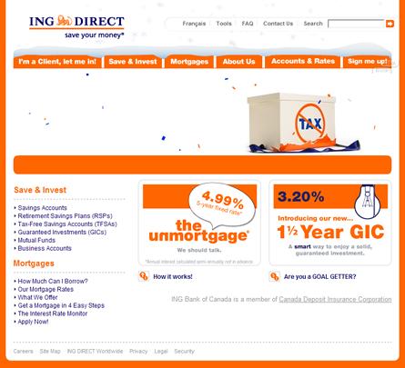
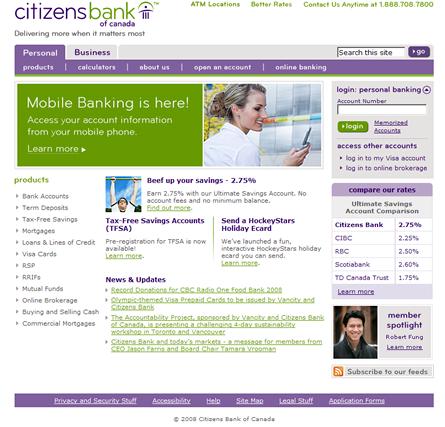
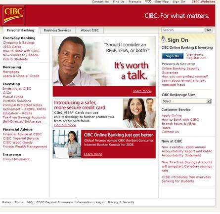
Note that this is not a formal survey, and I don't work for any of the organizations mentioned here. I have, however, worked on some sites for the Bank of America (through
Organic) and other web application for some banks in Canada and the US, but not as a designer.
Comments: