Digg's UI redesign is a bit user-unfriendly
Monday, December 18, 2006
Digg is cool, and sometimes unbearable.
The idea of news filtering is not actually new. Slashdot made its money this way: users submitted stories together with links, moderators approved them to let people make comments on them.
This formula generated a large number of hits and along came someone with bags of money knocking at ComdrTaco's doorstep to buy the business. The guy who started it,
Rob Malda, made a pretty penny and the owners let him keep doing whatever he was doing with the site. The rest, as they say, is history: slashdot is still kicking around, sometimes with old news, but it is still around. At one point I thought they should change their catchy phrase to "old news for nerds, stuff that mattered yesterday."
Digg is slightly different than slashdot, however, it is the same concept. The main difference is that anyone registered to digg can submit stories to get dugg by other registered users. There are no moderators, as there are in slashdot. If a story is good enough to make its way into the home page, it will do so by sheer number of votes.
It is as democratic as it gets. This is good and bad, as the common denominator predominates and it has been argued that the voting system is broken. Some users abuse the voting privilege by "digging" some friendly diggers' stories more than others. So, in the end the stories that make it to the main page are few and selected, and probably not the best stories.
The web site keeps evolving, some things change and others do not. The owners, for example, refuse to fix one of the main items people complain about (including me): the lack of threaded comments (use the
site, and you will see what I mean. I am sure there is a good reason for having this, but I am too lazy to look it up).
Changes to the interface are common, but I think the usability of the site has degraded a bit: going from minimalist to quite a lot of choices. For example, this is what the original application looked like (click the image to see a readable version):
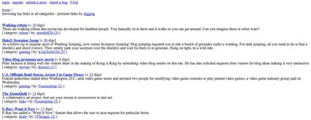
Aside from adding a search box, I would not have changed anything.
For the latest iteration, look below. When I stripped the site's content (the actual stories), I was left with 34% worth of stories, and the 66% left is composed of navigational links, advertisement, and informational links--and I almost forgot, they have space to sell digg T-shirts, too.
I personally think the original version is better, however, we cannot stop change. Moreover, priorities change and some money has to be generated at some point. This is after all another of those 3 facet business models:
1. Create a news filtering service.
2. ???
3. Profit.
This is what the page looks like now (click on the image to see a larger version):
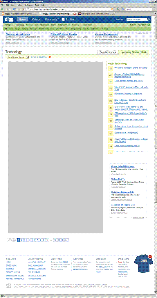
If it were up to me, I would start all over again and go back to a "less is more" design. The new page has 35 options of things to do before I can start clicking on the actual stories. I made this comment on the site, but I will probably get dugg down, which is part of the whole democratic experience: if you know a lot of users and are friendly with them, you will be dugg up, else suffer the consequences of negative diggs. (I am in the latter category of users, which is probably an indication of the quality of my comments.)
BTW, I do know that it is much easier to critique something than come up with something original and that it is really hard to design to please everyone under the sun, so note that I am just expressing an opinion. The site is still cool, regardless of cluttered new UI.
Notes:
1. I got the first version of digg's image from this
post (without permission).
2. I believe less is more. Google also thinks so (and they are worth billions, so they probably know what they are doing). Do you recall google's first web page? If you don't, this is what it looked like:
November 1998.
This is what it looks like now:
Current.
Remarkable, is it not? And google not only does search. They do a
lot more.
Comments: